Wednesday 8 December 2010

Some more pages from my RVJ


I thought it would be a pretty good idea if I actually got round to mind-mapping some of the crap that's been floating around in my head, and it's proved quite productive - a couple of new possibilities have come up; I wouldn't say it's finished but I've currently run out of inspiration.

 
After Chiu's comment on my first post I started looking at how the pages might look (very basically) if I chose to run with the fly on the wall art student idea, quite a few things are wrong; perspective, proportion, the character's face etc etc but they were only meant to be quick, shitty test drawings.


These are just a couple of drawings that are linked with a new idea that I've been playing with - the idea of creating a survival guide zine that reads like a wildlife documentary; with the types of people we see everyday in Birmingham transferred into animal for - in this case it's a raccoon Big Issue seller and a penguin police officer (the penguin isn't meant to be so comical - but it kinda accidently turned out that way). The animals used would be some way connected to the impression we have of each type of person. This is another unfinished page as I'm currently a little stuck for inspiration,  but I'm working on it.

AAAAAARRRRRRGHHH!

I'm finding it difficult to draw today, NAY, I'm finding it IMPOSSIBLE to draw today.

Jenna needs a total re-think and a face-lift because she's just not refined enough; I need her to be hardcore but sophisticated if Chiu's ever going to take her seriously but I JUST CAN'T GET IT!
I honestly just want to scream and throw my sketchbook across the room; but that wouldn't get me anywhere other than under my desk, crying.

Today is not going well......

Tuesday 7 December 2010

First few pages for Zine project


The first thing I started on was drawings that had been lurking in my head since the intro to this project, I had two ideas to follow these drawings, but one quickly fizzed out since it bored the sh*t out of me.
The idea I began to develop more drawings for was a fly on the wall kinda thing for a student in Birmingham - probably Vis. Comm - but I wanted it to be larger than life and quite obnoxious. Which is where this character appeared from, probably best described as an extention of myself.
I've so far done a couple of pages of drawings of this character, currently working on some more, a brief section of research on artists' books & zines (I plan to make a zine for this project) and just starting some research into a comic strip artist whose characters have inspired mine. 


A close-up of one of the first drawings I did - all nighters and falling asleep on your work is not cool. I've being trying to briefly annotate my drawings as I've gone along; mainly alterations that are needed and notes from ideas.


This was the beginning of another set of drawings that didn't turn out very well (the idea that bored the sh*t out of me) was essentially creating a map or a journey of a bar crawl along Broad Street, each pages working as a separate bar/club - with each image possibly bleeding into the next until the last one is difficult to see (because in reality you'd be wasted).


These were more studies of the character I would want to use in the zine - starting to look at expressions, drawing from other angles and the figure in an environment. I plan to create a mind-map quite soon to develop the content of the zine; places, events, story (if any) and drawing techniques & media, as these are areas that are still a bit blank in my mind.


This is my page on artists' books and zine, reference images are missing at the minute but I'm working on it.

Thursday 18 November 2010

I.T.A.P week six: 9.11.2010

The way we interpret everything is strongly influenced by the times we are living in; creatives will always respond in a way that reflects their time and attempt to capture the spirit and ideas of that particular period, an example of this particular principle is the development of the Winnie the Pooh characters.

Winnie the Pooh was first created by A.A Milne in 1926; the illustrator he chose for his original books was E.H Shepard, whose drawings were quite simple, black line drawings – which was one of the typical styles for 1920s illustration – his characters are modelled quite heavily on the stuffed teddy bears that were the popular toys of the time, not only that but A.A Milne’s inspiration when he was writing his books were his son Christopher’s personal toys (Christopher himself was also the inspiration for the character of Christopher Robin in the stories).

When the original books were reprinted in the 1970s Shepard added colour to his line drawings to bring them more up to date with the style of illustrations that were starting to appear.
When Walt Disney were given the rights to the Winnie the Pooh characters in 1961, the characters developed much further and became the familiar children characters that we know today – because they were created for animation purposes the colours are much flatter and brighter, the design of the characters themselves have become much cuter and cuddlier to suit the time period as it was during the 1960s that illustrations became much brighter and, due to Walt Disney, much more joyful and innocent.

Over the years more and more platforms have become available for illustrators and creatives to work on, not only does this allow for more freedom to express and develop idea, but it means that artists can break away from the typical platforms and branch out into more unusual areas that are better suited to their work and the audience that they are providing for.

An example of a creative that is currently working in an unusual format that portrays their work in an interesting way is Banksy; his graffiti work can be found on walls, floors, posters, flags and pretty much anywhere the public could look; although his work may seem to many people as vandalism, his images often portray his personal opinions on a variety of subjects; including politics, religion and the police force. Once his work had become better known and well-recognised, Banksy began creating exhibitions of his work, and even sneaking pieces of his work into famous museums and art galleries as a way of sparking interest and his own brand of controversy – although creating exhibitions seems like a step backwards as far as branching out goes, where Banksy is concerned it is a whole new platform for graffiti art to experience.

Wednesday 17 November 2010

I.T.A.P week five: 2.11.2010

The concept of having acts within a story was at one point restricted to theatre, but after the introduction of film, the idea of a three act structure became more of a layout for the plotline rather than three actual acts. The basic structure consists of a film having a beginning, middle and an end, but this is often translated into the main areas of the story; establish, crisis and resolve.
A film that uses this type of three act structure is “The Nightmare Before Christmas”; in the first act we establish the characters; our protagonist in this film being Jack Skellington and the world in which they live; Halloween Town. At this point we also see their everyday lives; they have just finished another successful Halloween so the whole town is ecstatic to begin preparing for next year.
The crisis occurs when Jack admits that he is unhappy with going through the same routine year after year. While wandering in the forest he stumbles upon various holiday doors, the Christmas tree attracts him the most, and Jack soon finds himself in Christmas Town – Jack is fascinated by this new and unusual place so quickly returns to his town to tell the citizens about his plans to take over Christmas this year, he kidnaps Santa Claus and sets off delivering his own brand of horrifying Christmas, the people of the real world notice he is an imposter and shoot his sleigh down – leading his friends to believe he’s dead.

The final act, resolve, begins with Jack regaining consciousness and realising his mistake, so he travels home to set everything right – starting with rescuing Santa and Sally from Oogie Boogie, Santa leaves to fix Christmas and Jack returns to Sally and reveals his feelings to her; we see the emotional change that has occurred in Jack.


The idea of the monomyth is that every story and fairytale uses the same underlying plot and ideas – to show this I have used the table from the lecture and applied it to the film “Constantine”;
I: Departure

The call to adventure
Constantine given the gift to see half-breeds
Refusal of the call
Commits suicide
Supernatural aid
Is revived by paramedics
Crossing the first threshold
Given his abilities and begins his work protecting the living realm
The belly of the whale
Finds out his lung cancer is in its final stages


II: Initiation

The road of trials
Exocising demons to earn his way to Heaven
The meeting with the goddess
Meets Angela
Temptation away from the path
Gabriel begs him to kill her now she’s human
Atonement with the Father
His faith in God
Apotheosis (becoming god-like)
Uses his powers to reveal Gabriel
The ultimate boon
The rising of Mammon is stopped


III: Return

Refusal of the return
Saves Isobel’s soul from Hell
The magic flight
Constantine rises to Heaven
Rescue from without
The Devil removes Constantine’s cancer
Crossing the return threshold
Angela made to hide the Spear
Master of the two worlds
Balance returned to the realms
Freedom to live
Quits smoking


Common Mythic Elements

Two Worlds (mundane and special)
Earth and Hell
The Mentor
Constantine (to Chas)
The Oracle
Gabriel
The Prophecy
The rising of Mammon
Failed Hero
Chas
Wearing enemy’s skin
n/a
Shapeshifter (the Hero isn’t sure if he can trust this character)
Midnite
Animal familiar
n/a
Chasing a lone animal into the enchanted wood (the animal usually gets away)
Chasing Angela as she is being kidnapped by Gabriel

I.T.A.P week four: 26.10.2010

I’ve discovered through this lecture that working with images and drawings the process becomes very different to when working with text and words; visual work is a much simpler way of putting across complex ideas compared to the same idea put down in text – by making ideas much more understandable we can go back to the idea at any point and continue to work with it.

Just like drawing by hand, visual language relies quite heavily on play and the creative right side of the brain – when establishing your visual language playing with an idea is the best way of expanding it and finding new possibilities that may otherwise be hidden or unnoticed, in a similar sense, getting into the habit of using visual language engages the right brain and means that it creates a new way of thinking that can produce new possibilities and ways of creating ideas.

Accidents are often a result of working visually rather than textually, but they’re not a bad thing – many ideas start off in one direction, but the same thing can often develop into part of something else, or it could inspire a more improved version or even a brand new, better idea.

Although visual language is playful and creative – it must be coherent otherwise it won’t be as effective as it could be; in order to build a successful visual language it’s important to consider what your communication goal is and who the audience is that you are providing for – an easy way to cover all this ground is mind mapping; not only does it take your thoughts out of your head so that more can develop, but by adding drawings or simply using colour and texture on the writing it becomes engaging and effective.

Being reflective and critical in the RVJ is just as important as using it to keep track of your ideas and inspiration, without notes and annotations marking what you like and what you don’t like, an RVJ is just a book filled with sketches and doodles that don’t mean anything – visual and textual language work incredibly well together if put together properly; pages and pages of notes and explanations are going to get boring eventually, so by combining important notes that provide details and specifics with attention grabbing drawings and illustrations that elaborate on your ideas, an RVJ can become a fully reflective, critical and engaging work space.

While working in my own RVJ, my experience with the reflective creative process has been an unsteady one; I find it difficult to include reflective annotations in my work as it progresses as it is something I have never really had to deal with before.
However, in some aspects of my RVJ the small notes I have been making are often particularly useful for refreshing my memory.
I plan to make the effort to work more with annotations and evaluation within my RVJ, along with visual and textual language in order to have a more complete and constructive RVJ.

Thursday 28 October 2010

I.T.A.P week three: 12.10.2010

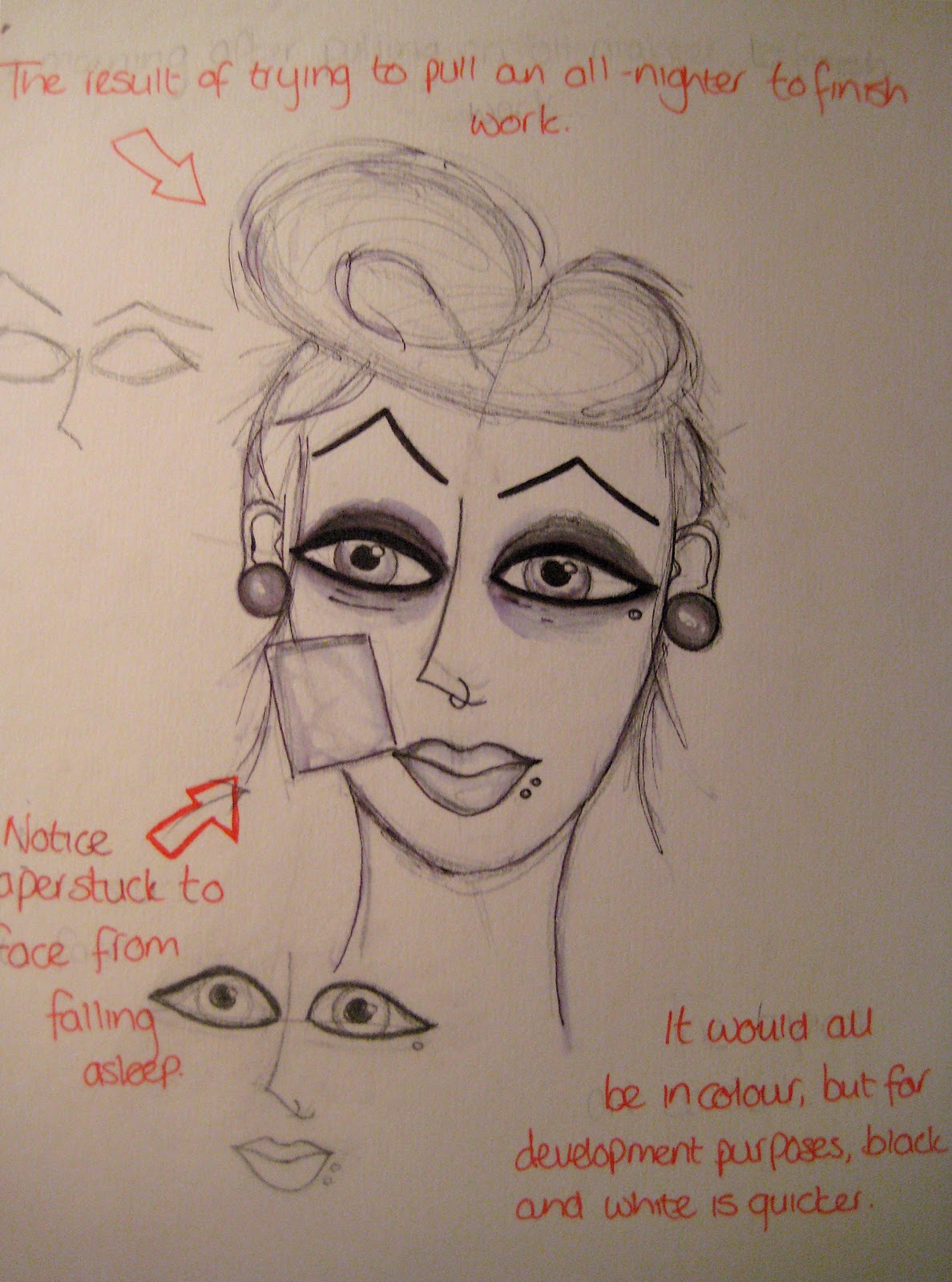
If pretty much everything around us is an advertisement, then surely we should be able to see and understand whatever it is that a company is trying to sell to us – it wouldn’t make much sense for a company to put a 20 foot poster at the side of the road with text so small that you would have to be 2 feet away from it to read it. Legibility is important, and it comes in a million different forms; whether it is thinking about the colour of the background compared to the colour of the text, or where the best place to put an image is. It is much easier to create an advert in the form of a flyer, or a small poster as these are handed out to the consumer, or placed in areas that are heavily populated with pedestrians so the designer doesn’t have to think about legibility too much because the viewer is much closer to the advert or is passing by at a much slower pace so the mind can process any details that, in some situations, would be completely inappropriate for their purpose.
However, when it comes to things such as road directions, maps of cities or tourist attractions or any large advertisement, notice or sign – then legibility is the first thing that the designer should be thinking about as these are important pieces of information.

The important parts of this newspaper front page have been designed in a manner that are not only legible to people walking past, but it also intrigues the reader and may persuade them to buy the paper in order to find out more about the story.

Although it might not seem like it at first, many of the images we see have been designed with their own tone of voice – one that the creator wanted to put across to us. These can cover all spans of areas; films, companies, people, brands etc. and can express any kind of emotion or feeling. This particular example is the poster from a newly released film; at first glance the viewer immediately gets the feeling that this film would be action-packed and quite serious because of the heavy use of red and black along with its bold, solid, quite graphic novel inspired layout. The use of photographs of the actors also add to the tone of voice that this poster creates as they are strongly arranged in each frame, not to mention the fact that most of the images show the actors armed with various weapons.
Although this is a very simple layout and concept, it is strong and memorable; which is exactly what you need when designing something like a film poster as this is much more likely to attract an audience than something complicated and cluttered. 


Sunday 10 October 2010

I.T.A.P week two: 5.10.2010

Illustration, to me, is all about understanding the subject before you jump into it – so the notion of using various techniques to further my understanding as part of the process of research was an aspect of this lecture that I actually appealed to; personally I am a little bit of a magpie – I collect things that I believe to be beautiful, whether it be clothing, trinkets, or merely something of a certain colour – I have to have it. And this collection often serves as a varied source of inspiration and ideas. Watching the world go by is something I also spend a lot of time doing as not only is observation something that was important in this week’s lecture, but it is important in everyday life as I think that by observing our world and what’s in it, we can learn and improve ourselves, and by doing this we improve our creative skills as well.
However, research would be nothing if all it consisted of was collecting things and observing what is around us; I feel that there is no better way to achieve a better understanding of your subject than to fully immerse yourself in it – studying the history, the practitioners, the various techniques etc. I also think that this should be done in a variety of ways; using reference books, the internet or by even going out and looking for exhibitions to explore, working practitioners to talk to.

This blends quite easily with my second chosen key principle, as the practises that are involved in research often spark inspiration; like I mentioned about my collecting habits inspiring my work. I believe that inspiration – when broken down – is strongly linked to curiosity in the way that we want to experiment with new ideas when they come to us, how we explore possibilities, previous practitioners work and simply the chain reaction one idea can cause in our minds – sparking off in numerous directions with a variety of results. I have always enjoyed the process of taking an idea and experimenting with all the different ways that idea can be used – whether it’s testing medias and materials, or techniques or styles of drawing and painting or transferring the idea from paper to computer image software.
But I also think that inspiration doesn’t just come from research, or experimenting – it can come from anywhere at anytime, which is why I often think I should always be prepared with a small sketchbook and my camera in order to document anything that happens to interest me, and it can be something incredibly small and insignificant, or it can be something that is well known and has inspired practitioners before; a number of illustrators mentioned in the lecture said that they sketch a lot and can often fill a massive number of sketchbooks, and some even use their sketchbooks as their exhibited work. 

Wednesday 29 September 2010

Integrating Theory and Practise week one: 28.09.2010

Talking about “The Notions of Originality” is a difficult task, mainly as it is such a wide topic. Can something ever be original? Or will we forever be stuck in a cycle where art will always be “paying homage to...” or “based on the work of…”? I hoped this lecture would answer its own questions, but it has also left many more for me to explore on my own.

There are many works of art that have become popular inspiration for artists throughout the centuries after the original was created, one of these pieces that came up in this particular lecture was Diego de Silva Velazquez’s  “Las Meninas” this piece is considerably well known, and has been re-interpreted by a number of artists – most famously by Picasso; his piece, by the same name, is obviously paying homage to the original as the layout and the shapes are very similar – but in Picasso’s style he has deconstructed the painting and seems to have worked with what he found to create something of his own. In its own right I think that Picasso has made this piece original, because it is the only one of its kind in his particular style of painting. I personally don’t think that because an artist uses images or ideas from another piece, that their work isn’t original.

For the second part I thought to consider whether recontextualised ideas can be contemporary, and over the course of this particular lecture I began to think that yes, they could be contemporary. But then I began to think about the possibility that by recontextualising an idea we take away the intrigue and excitement that comes with creating a new idea, and that this can lead to a lack of passion for the work – which I believe would be visible to the viewer. However, even though I am pretty certain that recontextualised ideas can’t be contemporary, there is an aspect of me that can’t help thinking that maybe there is a way to reconsider a concept and create something new and original.

A particular theme that has been recontextualised over the centuries is the story of Adam and Eve; the earliest depiction of this scene is Masaccio’s “Expulsion from the Garden of Eden” (1472), then in the 1980s Ron O’Donnel created “Expulsion” which although follows the same idea, is a much more contemporary and surreal finished image.